UX / Experience Design — Case Study
Establishing The Days of Knights as a welcoming entry point within the board game and TTRPG community by providing a guided experience for newcomers to find, play, and connect with others who share their interests.
Created in collaboration with Addy Nare and Genevieve Gore
✦
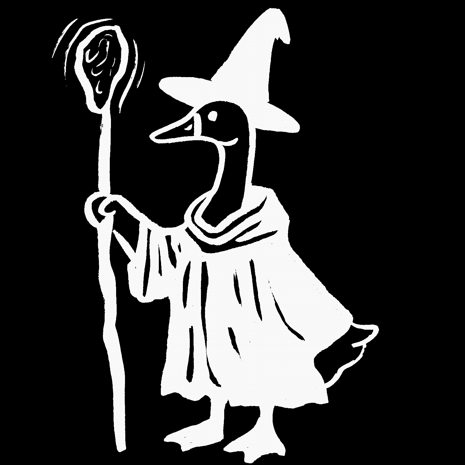
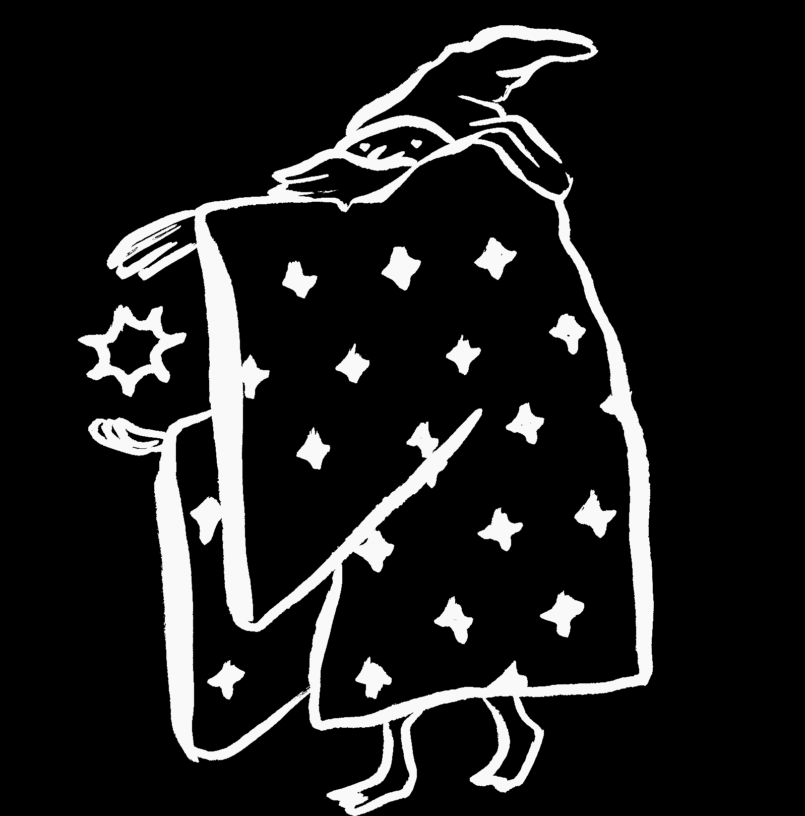
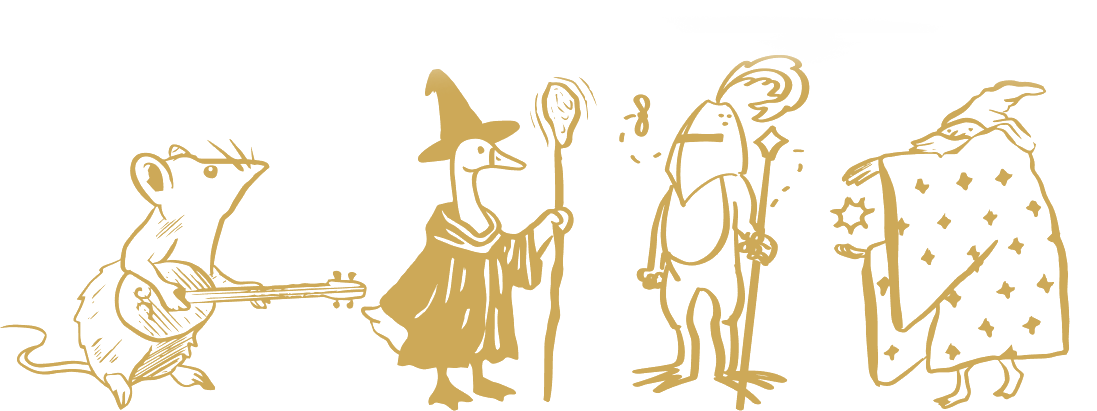
Duck Illustration by Jenna Kaufman

Rat Illustration by Jenna Kaufman
Wizard Illustration by Jenna Kaufman
✦
Client
The Days of Knights × Grain Craft Bar + Kitchen
Challenge
Grow beyond the established TTRPG audience
Customer Base
80% University of Delaware students & alumni — multigenerational
Popular Events:
Magic: The Gathering · Board Games · D&D
Core Challenge:
Lack of online presence; difficult shopping UI
The Problem
New and potential gamers in Newark experienced uncertainty engaging with The Days of Knights without prior connections within the TTRPG community — limiting broader participation and preventing the store from extending beyond its established audience.
The Solution
Fostering community engagement through a curated game night experience that allows participants to find games to their liking and connect to both established Days of Knights community members and new players — all in a free, welcoming environment.
Style Guide:
Title, Level 1 Heading: P22 Sting
Header, Body, Caption: Le Monde Livre
Patterns & Textures: Inspired by medieval illuminated manuscripts’ intricate adornment and geometric shapes. Incorporating textures from textiles like velvet and silk as a backdrop.
Motifs & Accents: Stars represent luck and guidance; part of playing games and establishing DoK as a north star in the world of TTRPG. Linocut-style characters with a goofy tone.

P22 Sting

Le Monde Livre
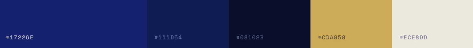
Primary Palette

Secondary Palette
✦
"The value in the store is the experience and suggestions it can give customers, as well as being a place to play."
— Joe, Store Manager
✦
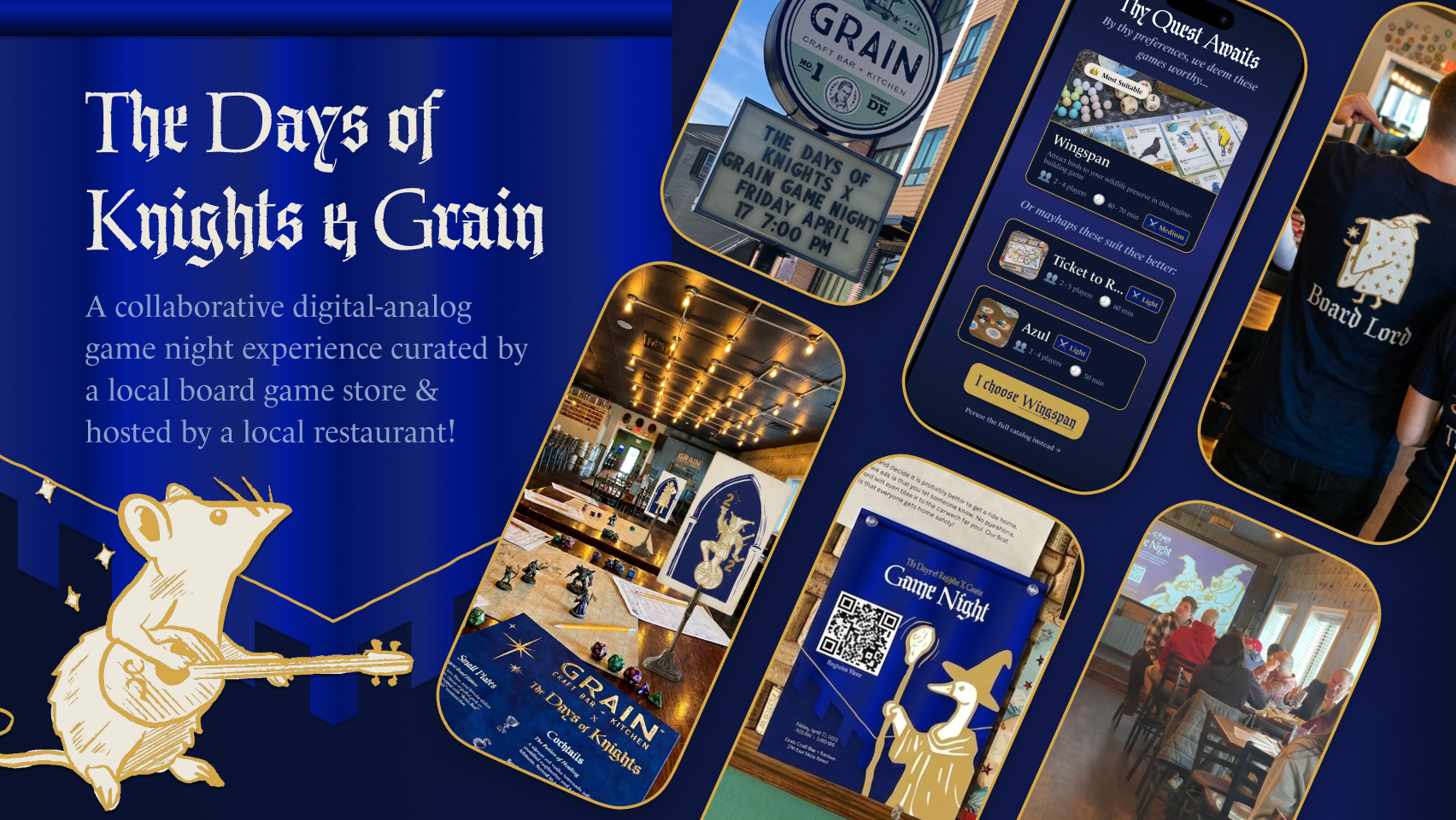
Deliverables
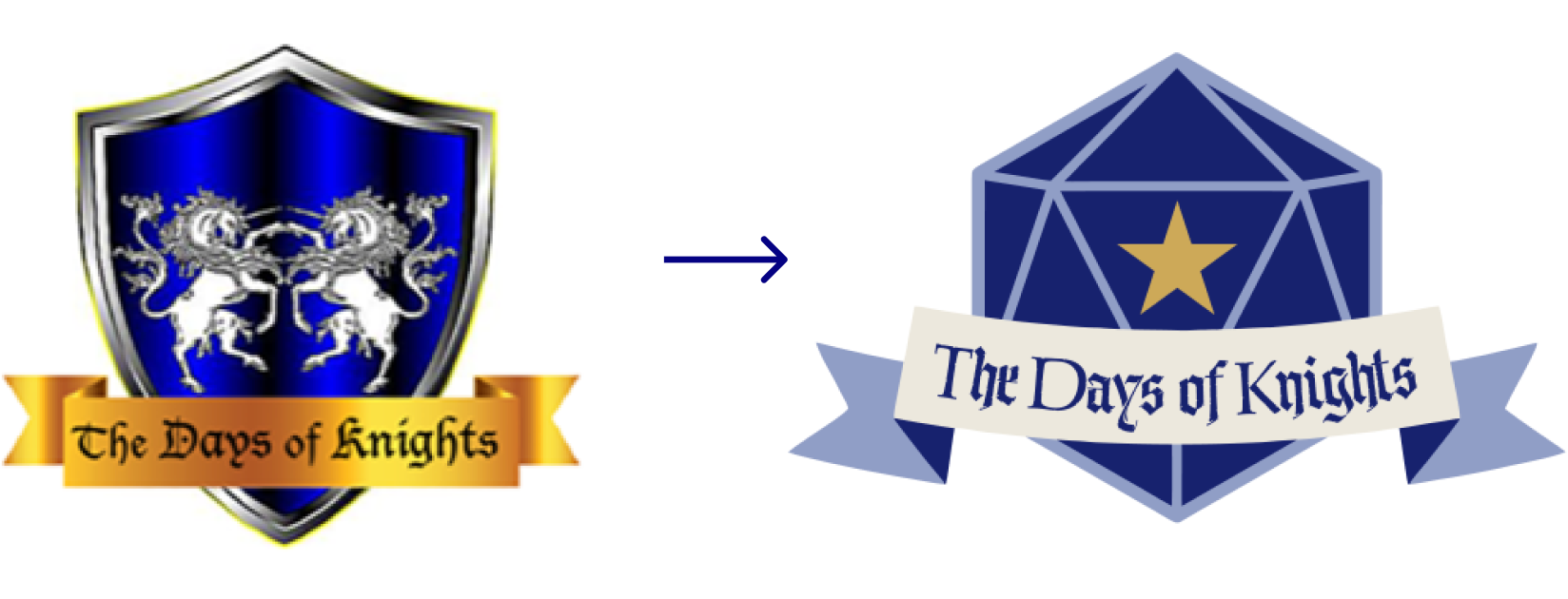
Logo Redesign: Refined the brand from a complex shield to a clean dice-inspired shape, modernizing for digital use.
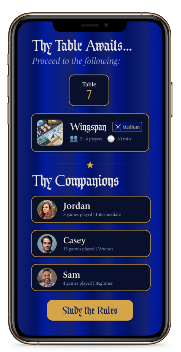
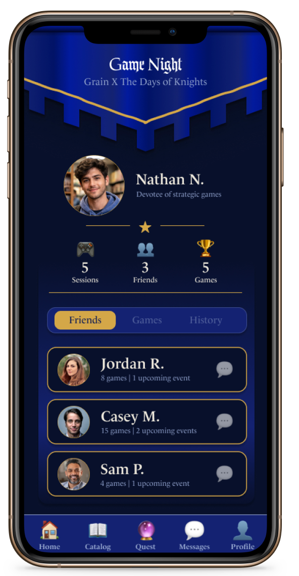
UI Prototype: A mobile matchmaking interface that guides users through game preferences, matches them with companions, reveals their table assignment, and links to game rules.
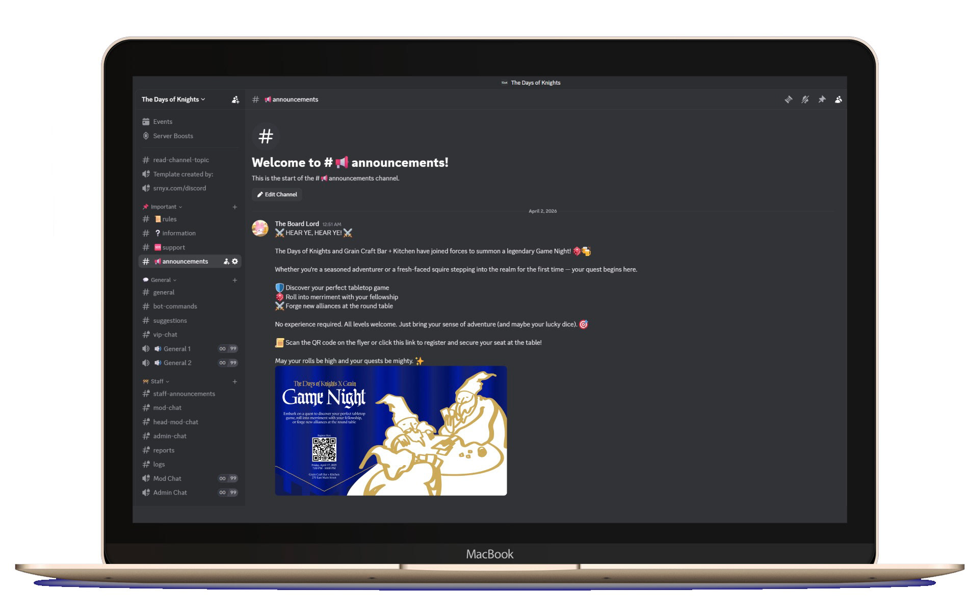
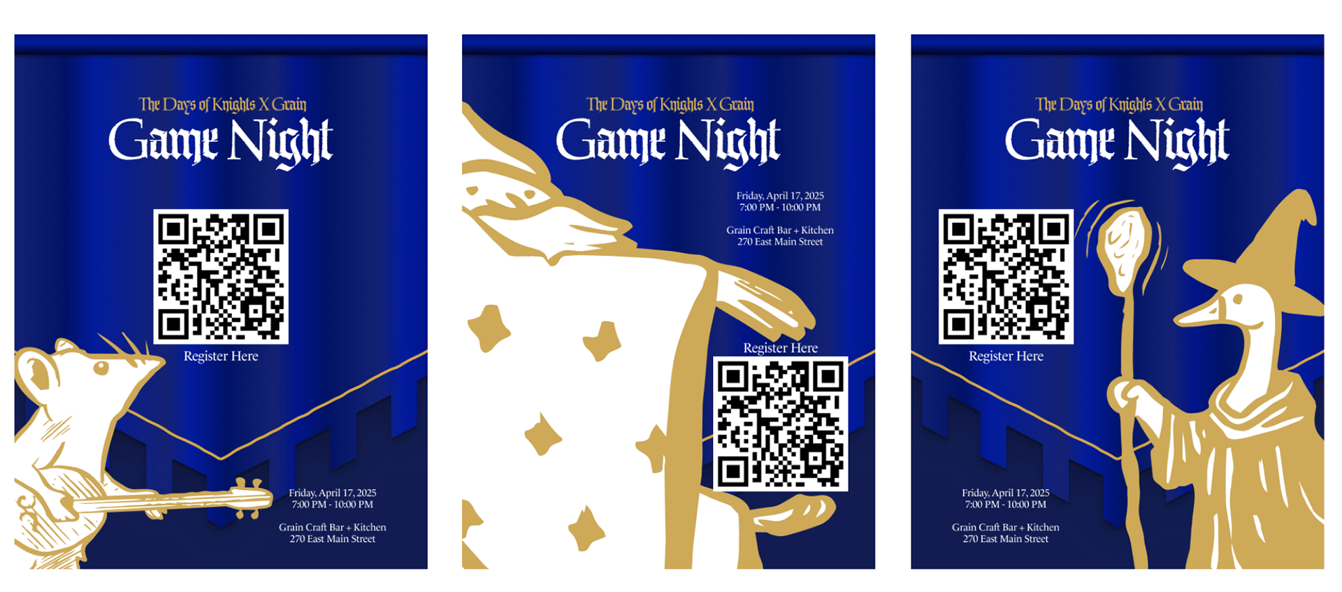
Print & Digital Promotion: Three poster variants featuring linocut-style characters, QR registration codes, and event details, along with Discord announcement templates for the store's online community.

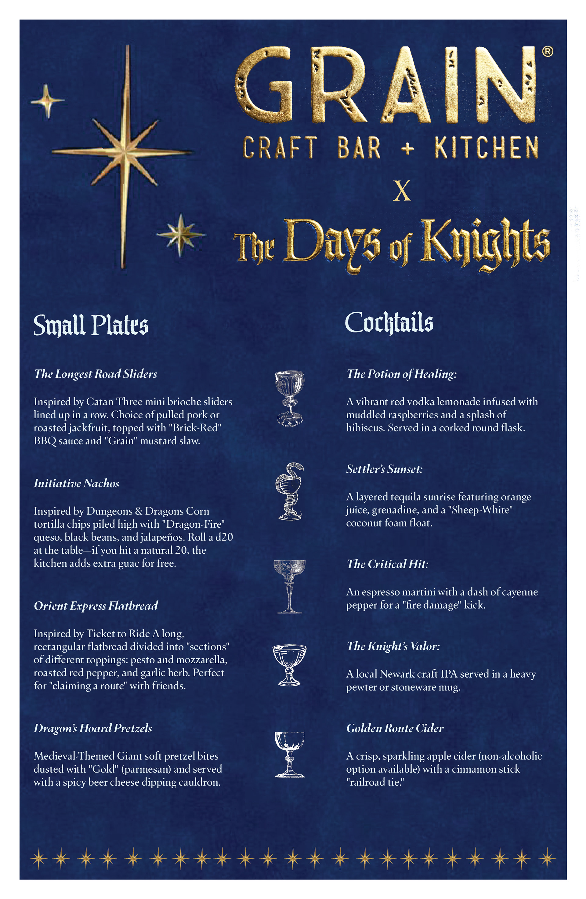
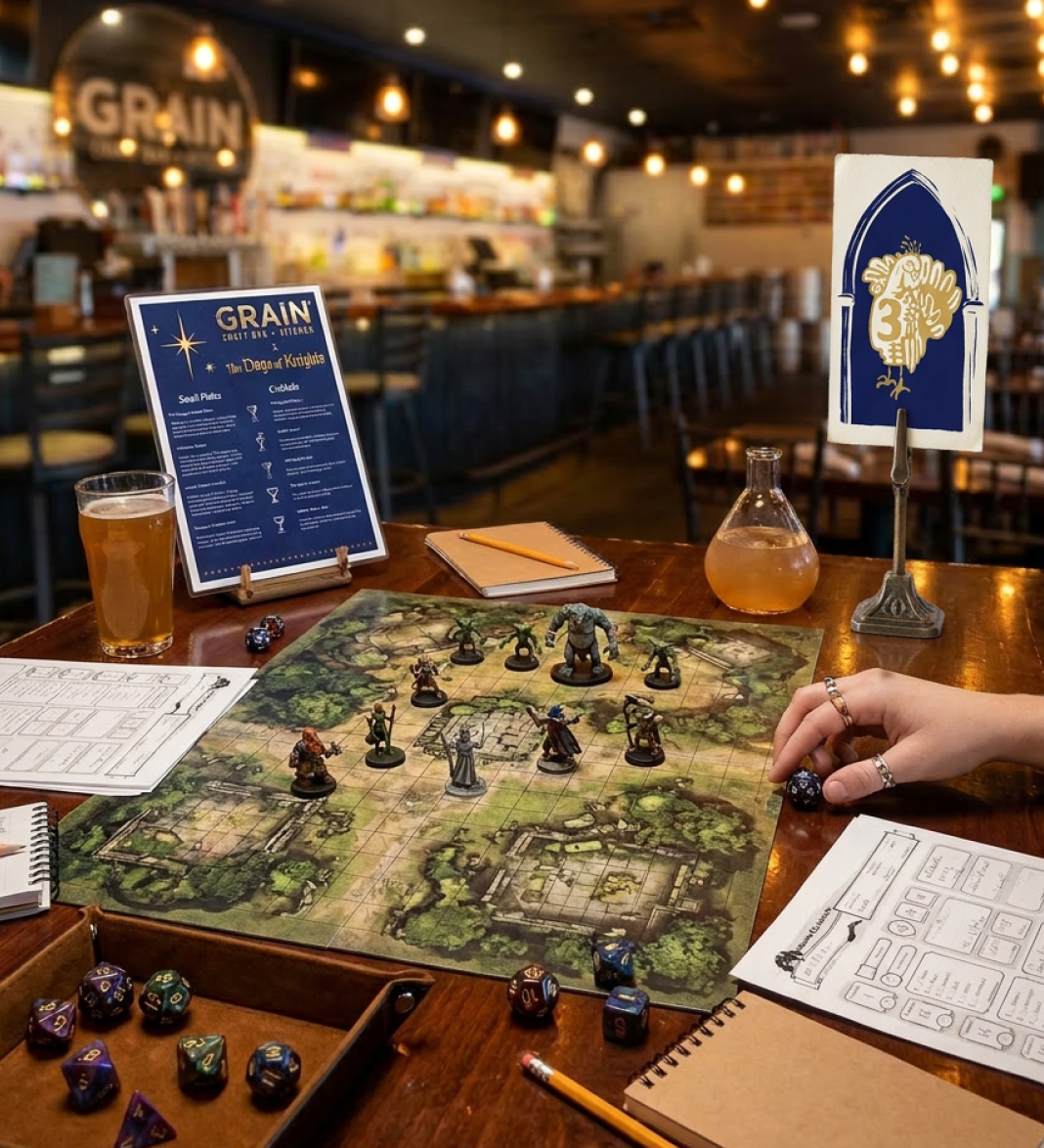
Menu Design: A co-branded Grain × Days of Knights menu featuring game-themed small plates and drinks.
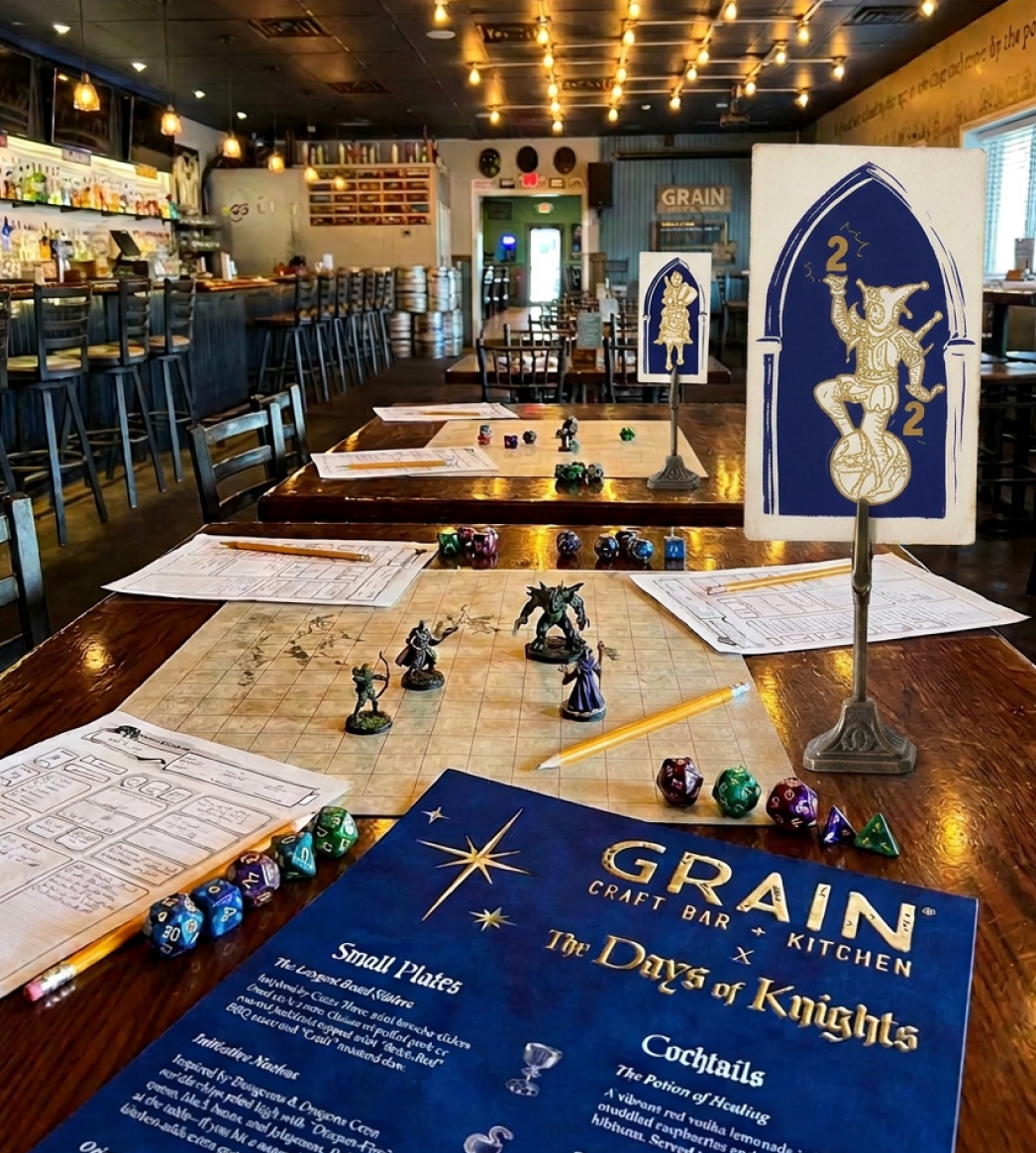
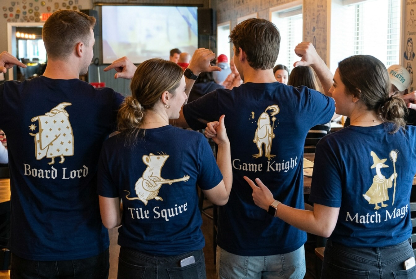
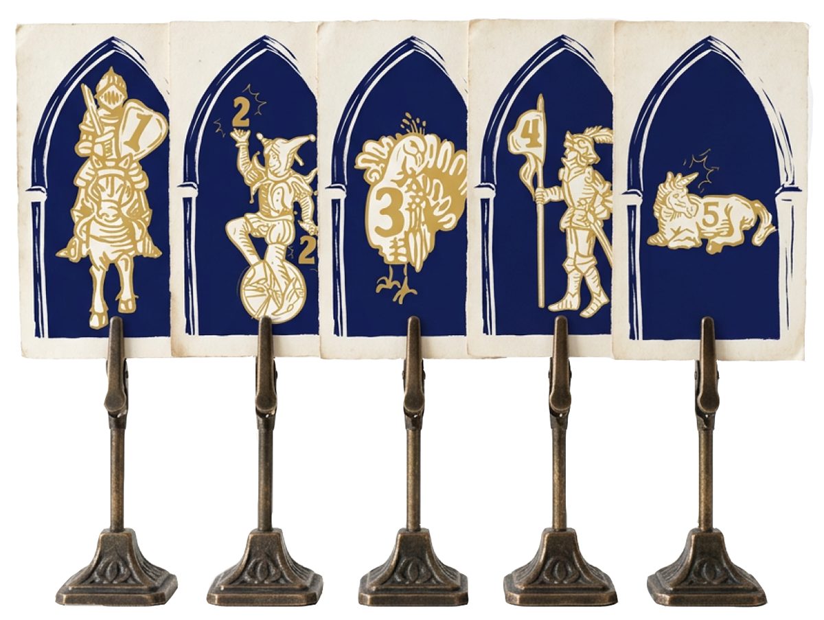
Experience Design: Worker t-shirts with medieval character roles (Tile Squire, Board Lord, Match Mage, Game Knight) and illustrated gothic arch table markers, making staff instantly identifiable and on-theme.
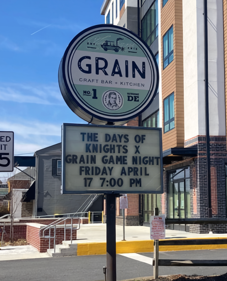
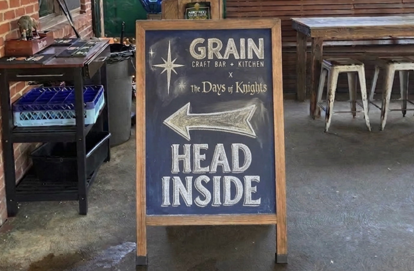
Environmental Signage: Physical wayfinding, including chalkboard boards and street marquee promotions placed at Grain and throughout Newark to attract foot traffic and curious newcomers.
✦