Project Overview:
3M Command™ makes damage-free hanging strips, but its packaging reads hardware aisle, not dorm room. Linda Taube and I rebranded it for college renters: new packaging, a social campaign, and a campus pop-up.
The Problem:
Looks like it belongs in your dad's toolbox. Packaging signals utility over personality. Nothing on the shelf says fun, interesting, or mine.
The Solution:
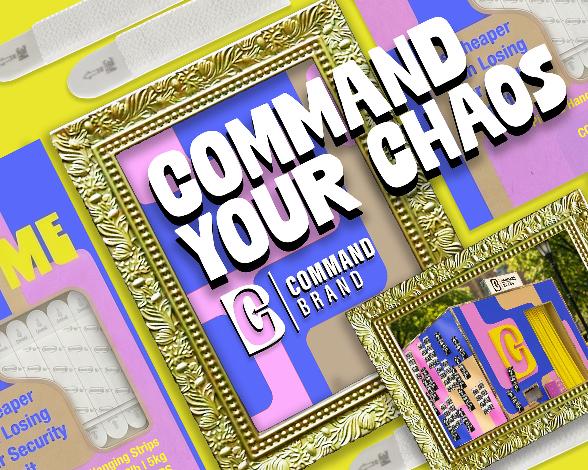
Command Your Chaos. Bold packaging, exciting promotion, and a campus pop-up to reposition 3M Command™ as a dorm essential, not a hardware purchase.
Research & Discovery:
Current Audience
Renters
Prohibited from making holes in walls: Need a damage-free way to personalize their space.
Young Urban Adults
Aesthetic-driven and digitally-influenced. Wants products that fit the visual identity of their space.
DIYers and Homeowners
Tool-free organization and seasonal decoration. Not the focus of this activation.
Key Takeaways
Consumers' main fear is that the product will fail. Current design targets hardware aisles, not mood boards. No emotional connection to the brand for the target user. Social media presence lacks a consistent voice or aesthetic.
"Command Brand is all about empowering you to try something new and bring a unique style to life."
— Tate Galvin, Global VP Home Improvement, 3M
The Big Idea:
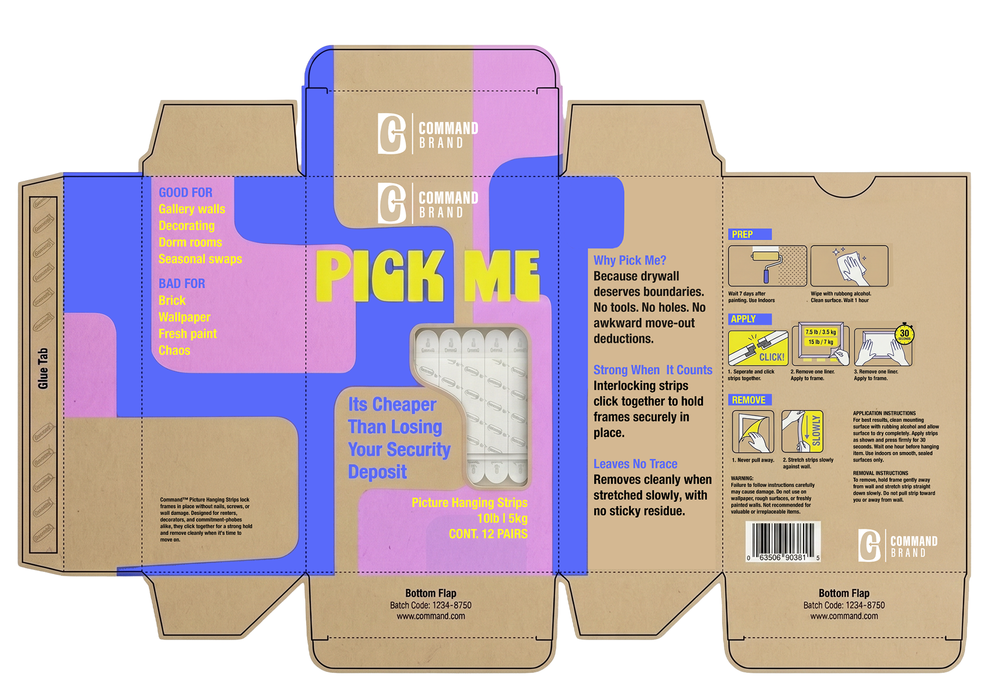
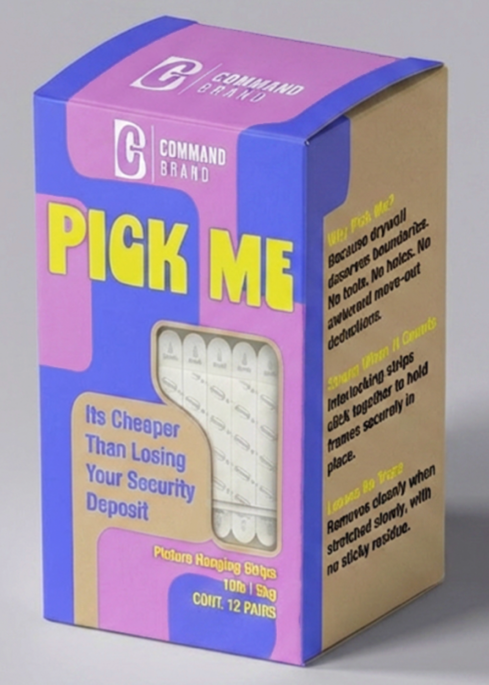
01 Packaging Rebrand
Youthful, colorful, and bold. The new packaging is designed to live on a mood board, not a hardware aisle.
02 Digital Promotion
Video content for social media showing real use cases, gallery walls, LED strips, dorm transformations, hanging up photos, in the audience's language.
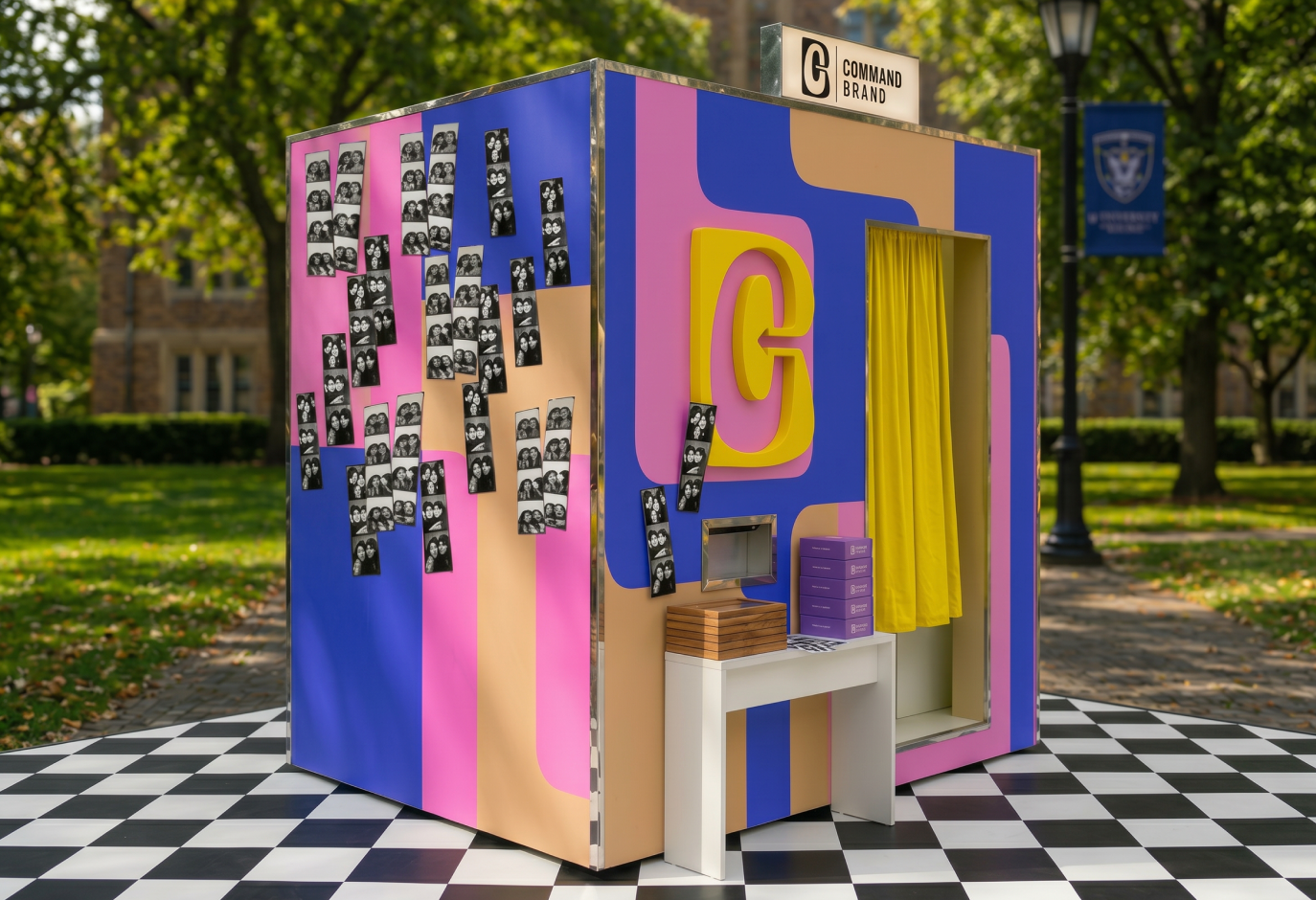
03 Campus Pop-Up Event
Branded photo booth on campus. Students print photos and hang them using Command strips, keeping a copy for themselves to share or bring home. The product demonstrates itself.
01
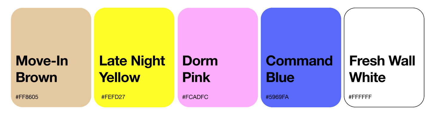
Color Palette

Pattern
02
03